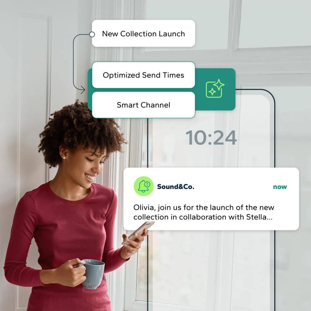
At the time of web 4.0, mobile use has exceeded the use of a desktop computer. Indeed, 55% of email openings are mobile and this statistic continues to increase. This puts a higher pull on creating effective responsive email. It is therefore mandatory for all companies to take the responsive turn, if it is not already done.
This reality plays a significant role in how you structure marketing content moving forward. If you want to ensure effective performance on all platforms, you must first consider and test your content in different displays. This is why before talking about technology, we must first discuss the contents.
Here are 4 points to help you properly plan for mobile versions of your content.
Step 1: Evaluate the content of your responsive email
Take each section of your newsletter or email message and evaluate the priority for each section in a desktop versus email version. For example, the image, the name, and the link of your product are essential, but do you need to add the description? In this example, the description has been removed from the responsive email version.

Example : Beyond the rack
I usually suggest to assign a rating score of 1 to 3 to their content. Elements identified with a 1 or 2 rating are preserved – the 1s are mandatory and the 2s are lower priority and can be arranged at a lower hierarchical level (at the bottom of the post). The 3s provide no value and will be removed in the mobile version.
Step 2: Validate your images
A picture is worth a thousand words… only if it is readable! In a responsive email, reduce the size of your images at 320 px. If the content is unreadable, you’ll have two choices: develop a new image for your responsive version or change your main image using a larger font. In some cases, if you use banners with distinct areas (left text right images), you might think it is relevant to withdraw the left image and use only your right section.
Don’t forget, you can use different images for responsive or simply adapt your design. Also, compress your images in your mailings to reduce their loading time. It is often forgotten but most people who open an email on their phone are on the LTE network, which is slower to charge.
Step 3: Think of a new design for responsive email
Once you have selected your content and identified the preferred method for processing your images, you just have to develop a design that fits. It’s a good idea to use separate columns based on your content priorities.
For example, your level 2 rated content arranged in a column on the right, can be found at the end of your message. This solution frees up the entire width for your mobile version and your main content.

Example : Beyond the rack
Also, consider developing a separate display mode for your menu if it’s not suitable or too broad for your mobile version. Here’s an example of this type of scenario, and the mobile version displays the menu on three separate lines.

Example : Ontario Arts Council
Remember in your new design that your readers will click with their fingers, and they are not all alike. Develop a model that adapts automatically with responsive technology.
An automated email marketing platform like Dialog Insight has already developed several mobile-based templates. This way, you don’t have to worry about making a responsive email version and your content will automatically adjust. The idea is not to increase your work but rather the effectiveness of your mailings.
Step 4: Test and control the results
This last step is crucial for all your email communications, including responsive email. Perform testing, make sure that you are able to click, view the message in every possible way, test each version and confirm if your clickthrough rate improves. There is no miracle recipe! If your results are conclusive, we strongly suggest you to create a guide that can share with all your colleagues who are also engaged in email communications.
Conclusion
The good new is Dialog Insight offers ready-to-use responsive email templates. All you have to do is choose your favorite template, add your content and colors, and that’s it!
If you need help to execute our advises, our team can help you plan your content and find an effective solution to increase your results without spending more of your time.


